Light and shadow, space and composition are the principle elements of Serena Bisceglia design philosophy distilled in its refined identity
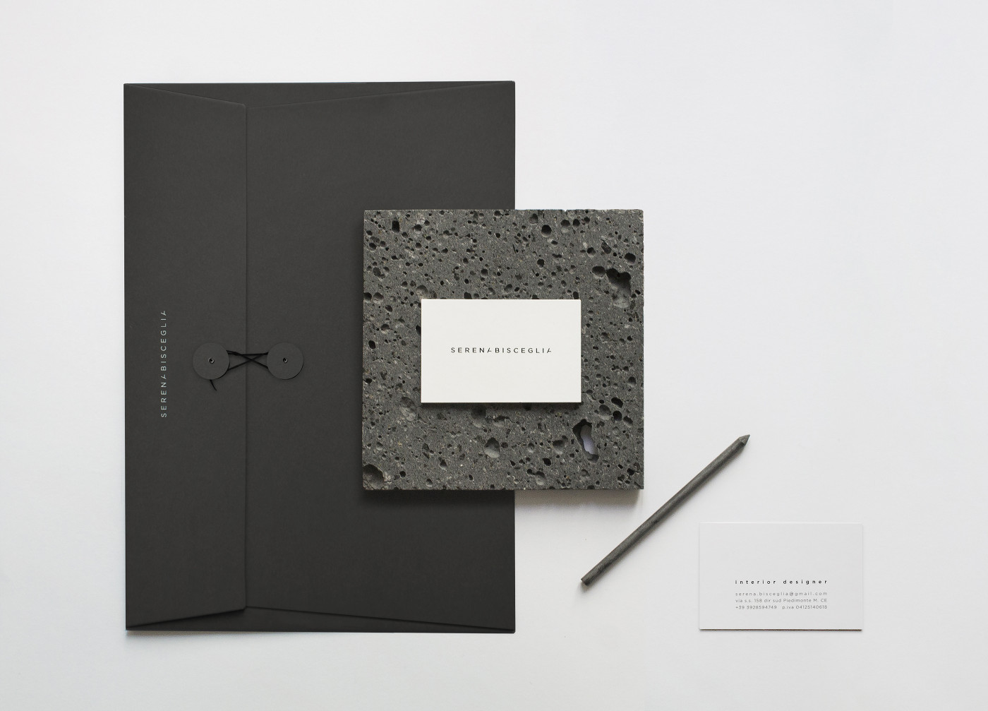
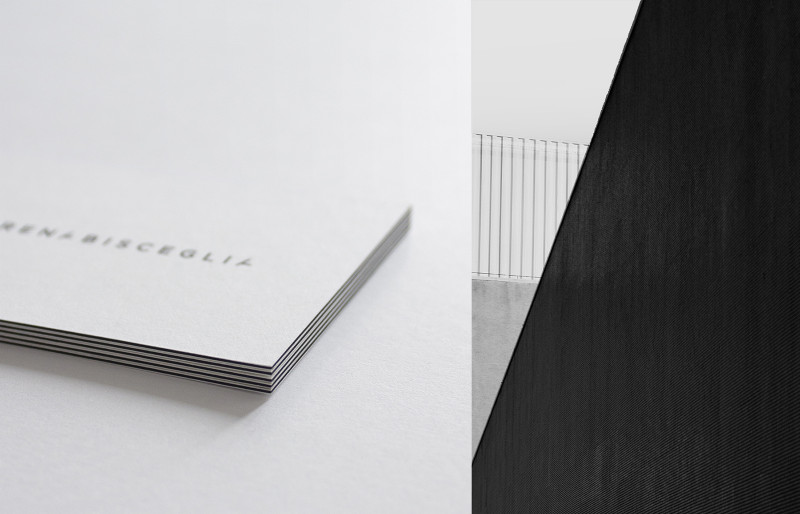
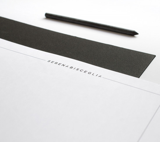
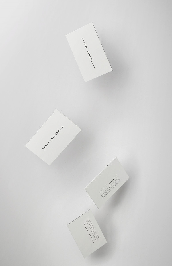
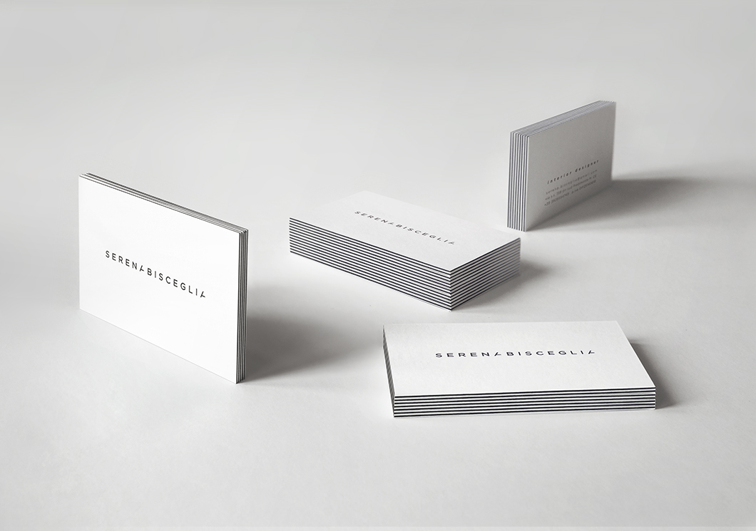
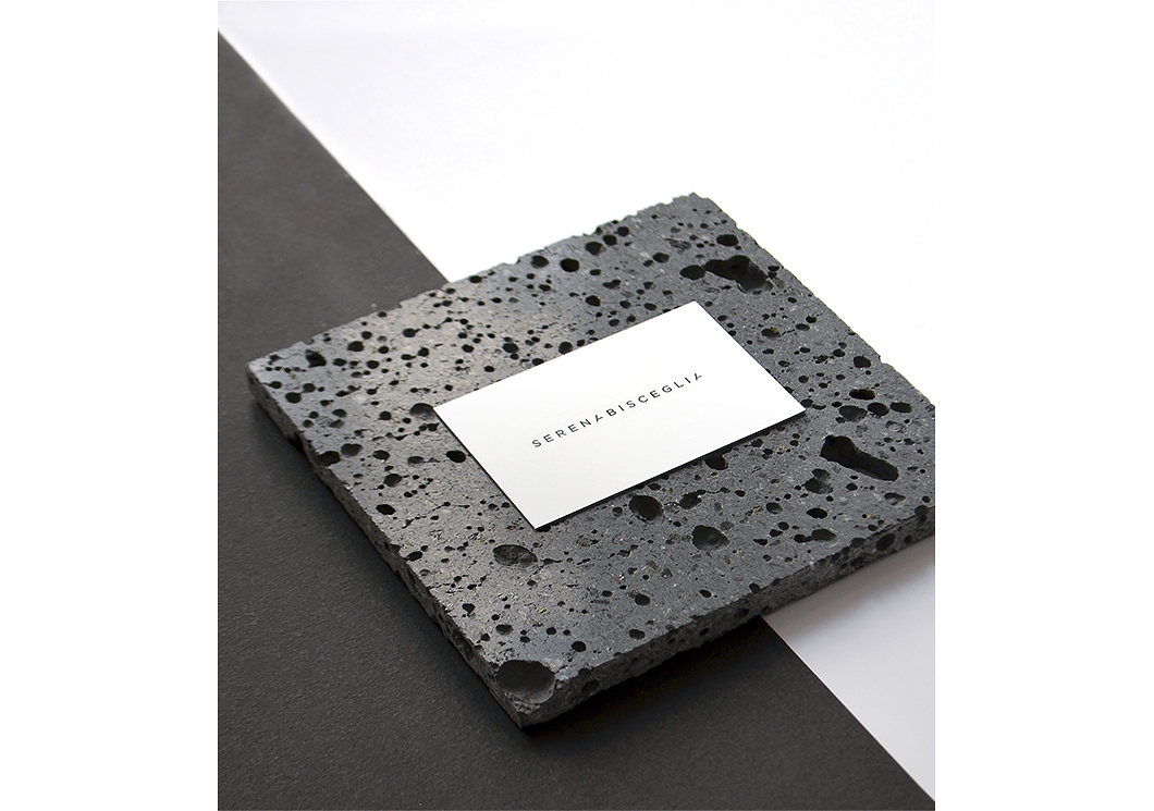
The identity of the Interior designer Serena Bisceglia is a graphic synthesis of the principles of her design poetics: to create spaces in which light and shadow mold unique and evocative scenarios and design harmonious and elegant space compositions, both familiar and incredibly innovative. Hence the architectural construction of the logo in which lines, cuts and rhythmic spaces mark the succession of the letters. Even the business card, built by the layering of white and black paper sheets, responds to this architectural poetry that embraces everything. Above all, the contrast between light and shadow, black and white, builds an abstract landscape where spatiality, composition and rhythm tell of the passion and unique style of the architect.
Photo+styling © studio zero
 Previous project